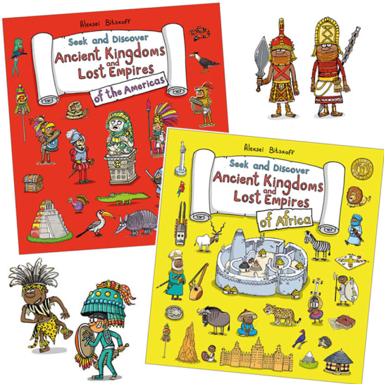
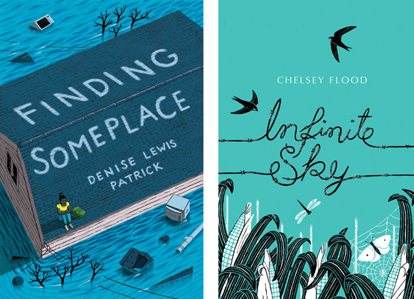
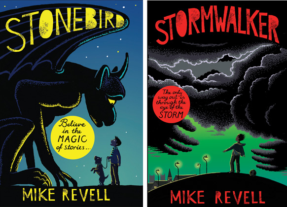
Book covers often require a design solution that can be crystallised into a stronger cover using hand lettering and illustration together. The art of combining these two forms is often tricky to achieve as each book deals with different subjects. Frances Castle was asked to produce the title lettering for Finding Someplace a novel set after Hurricane Katrina and during the floods of New Orleans. When approaching Infinitie Sky, set in the height of summer, to communicate the feeling of entrapment she used barbed wire for the scripted lettering. The new novels for Quercus by Mike Revell needed a different approach entirely and she worked with the designer to achieve the blocky, textured title lettering.
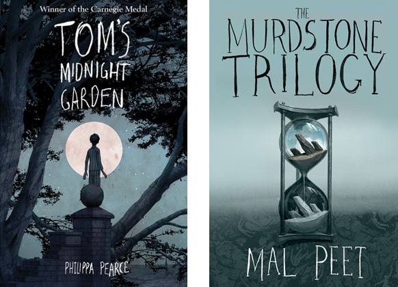
Levi Pinfold is also very skilled at mixing had drawn typography with his cover artworks, emphasising the fact that these covers have been drawn and the images reflect the stories within the pages.
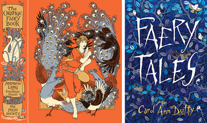
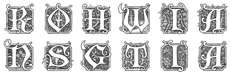
Tomislav Tomic is our most accomplished typographer easily mixing his integral hand drawn type into his beautiful designs. Each one has again a different approach. When he tackled the Orange Fairy Book for the Folio Society, the design was in a limited palette printed onto a coloured linen hardback edition, within a slip case, so the lettering was mainly for the spine and the title page. His Faery Tales cover for Faber and Faber’s collection by Carol Ann Duffy was spiky and fitted perfectly with the intricate pattern of leaves and birds with two hidden faces peering out. He is very skilled at illuminated letters, in the example below each one was decorated with an illustrative theme which evoked the faery tale. Also great at maps, Tomislav has the enviable skill of making an image look as if it has always existed.
