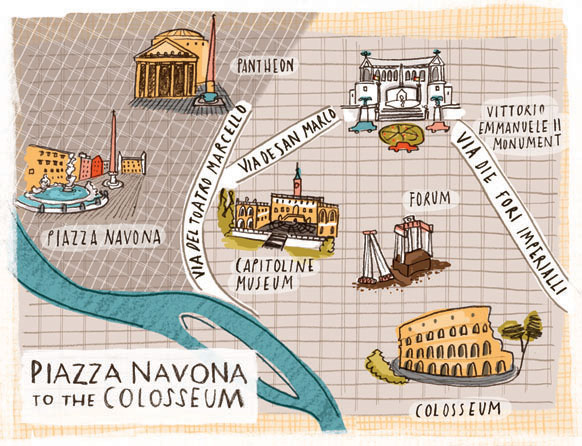
It’s time for part three of our map blog, and we have a variety of artists work showing contemporary cartography. We start with Kristyna Litten and these small images from her three dimensional expanding city skyline book of Rome, published by Walker.
Kristyna always has a beautiful use of colour, and a fantastic way of layering textures.

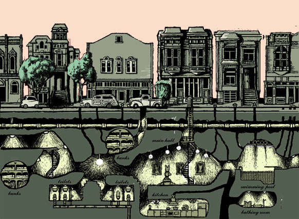
Here we have a very different kind of map by Frances Castle. Compared to the maps we have already looked at, this one is unique. Pushing the boundaries of a conventional map, it is still represents space in an informative way and it is of a world, not meant for humans but an underground network for rabbits, and a very sophisticated one too!
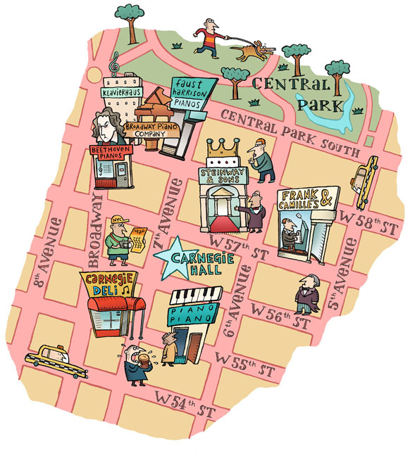
Spike gives us more of a graphic edge with this map for Piano Magazine about the best classical music spots in New York.
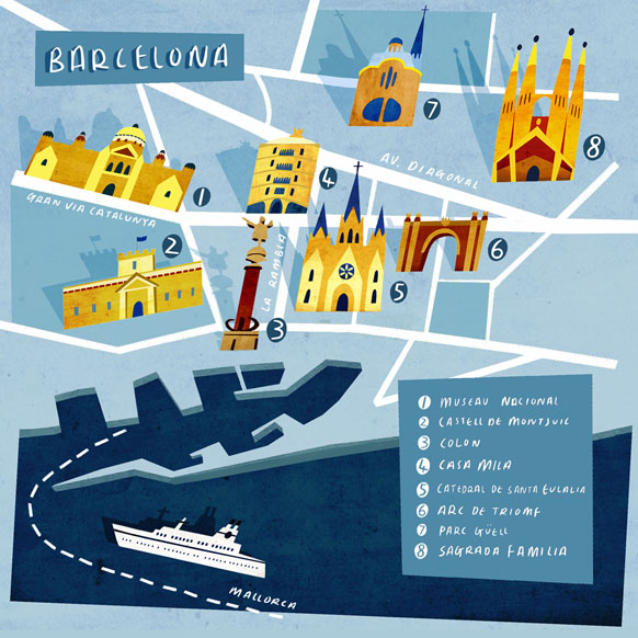
Emily Fox’s beautiful depiction of Barcelona comes with a map staple, a key. Again showing off some excellent hand drawn typography, the limited colour palette makes the buildings stand out off the page.
Have a look at our previous posts on Maps, Part One: David Hitch and Part Two: Detailed Maps.

